Operating unit for a gas heater
Ergonomics and clarity or: the school of product language
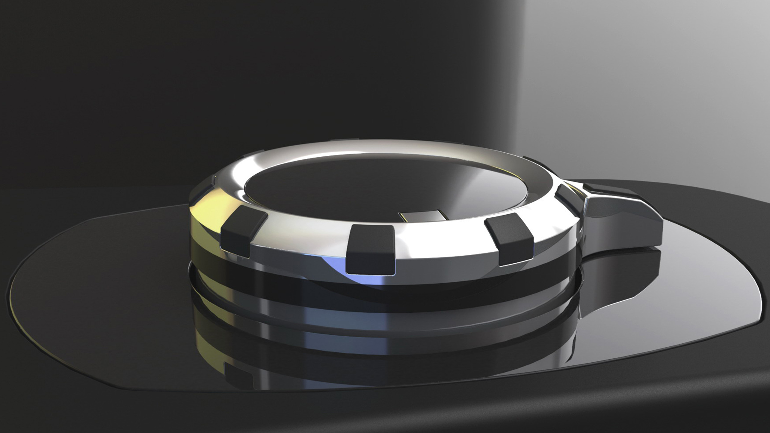
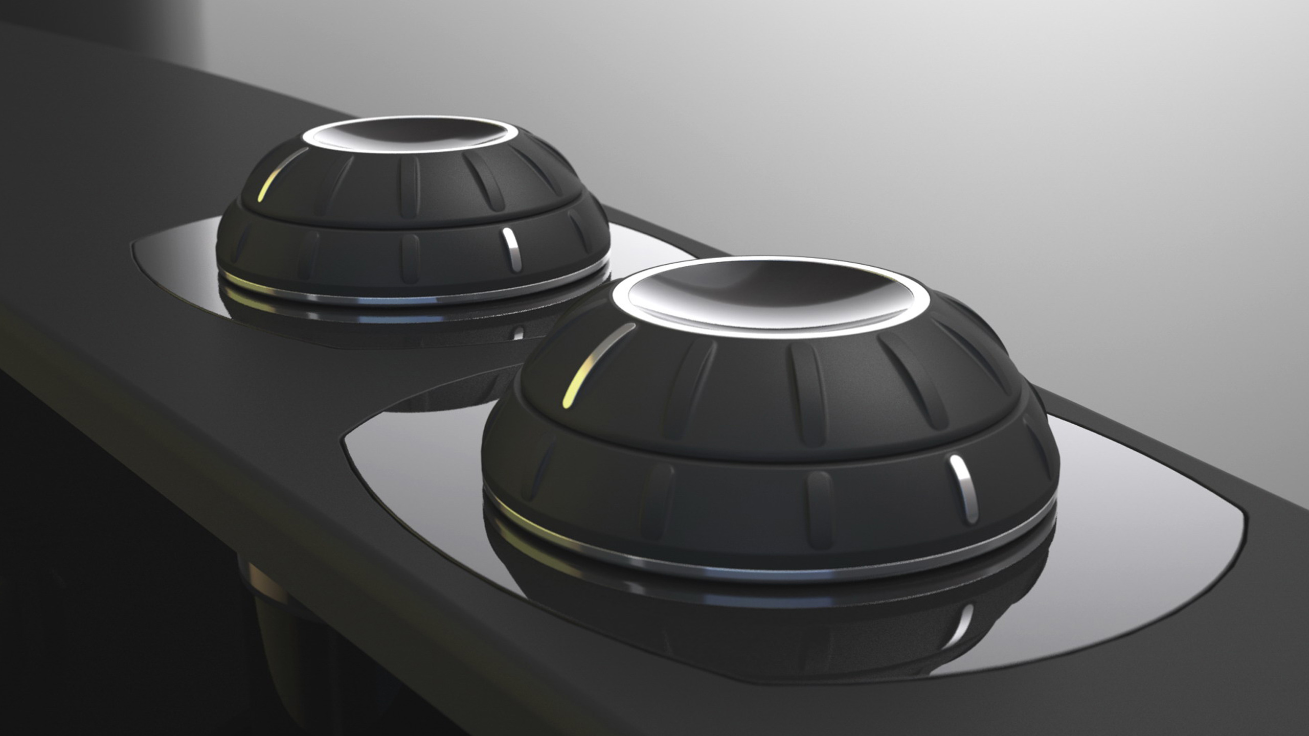
The actual design task for this product was to make operation clear and simple. The combined pressure control dial with double rotary knob is surely the best solution in terms of mechanics and economics. The operation of the device is therefore concentrated in one unit and is somewhat complicated. The user must quickly learn how to set the dial, what happens when the central knob is pressed, how much strength might be needed and which functions the individual operating elements control.
A classic design task which means using a product language we have all learned throughout the course of our lives:
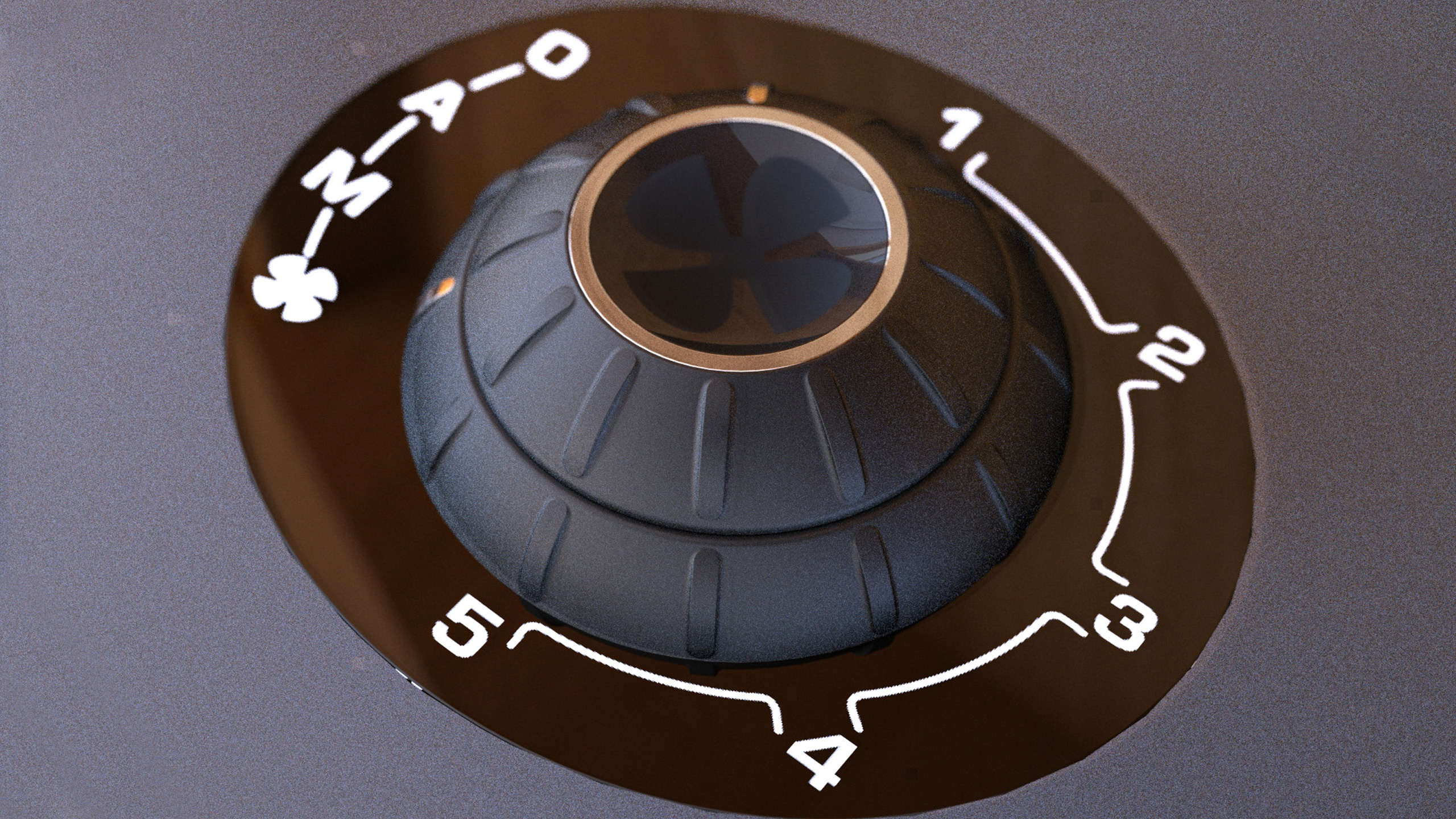
The concave surface on the top side of the dial shows that it is possible to press it. The ventilator icon shows which function is being regulated. The fine ribs on the outer surface (or the rubber knobs of the model illustrated above) show that the ring can be turned. The basic cone shape allows force to be introduced and shows that it must be pressed with force. The seams between the individual elements let us know the direction of rotation and number of individual operating elements. The product graphics explain various power stages and basic functions. A complex interplay of two- and three-dimensional information which can be correctly interpreted when it is well designed.
x

